


Goulburn Valley
Revitalising a cherished fruit brand, steeped in tradition, to help reclaim its crown as the quintessential top-notch choice in the market.
Goulburn Valley
- BRAND STRATEGY
- BRAND IDENTITY
- PACKAGING DESIGN
- BRAND ACTIVATION
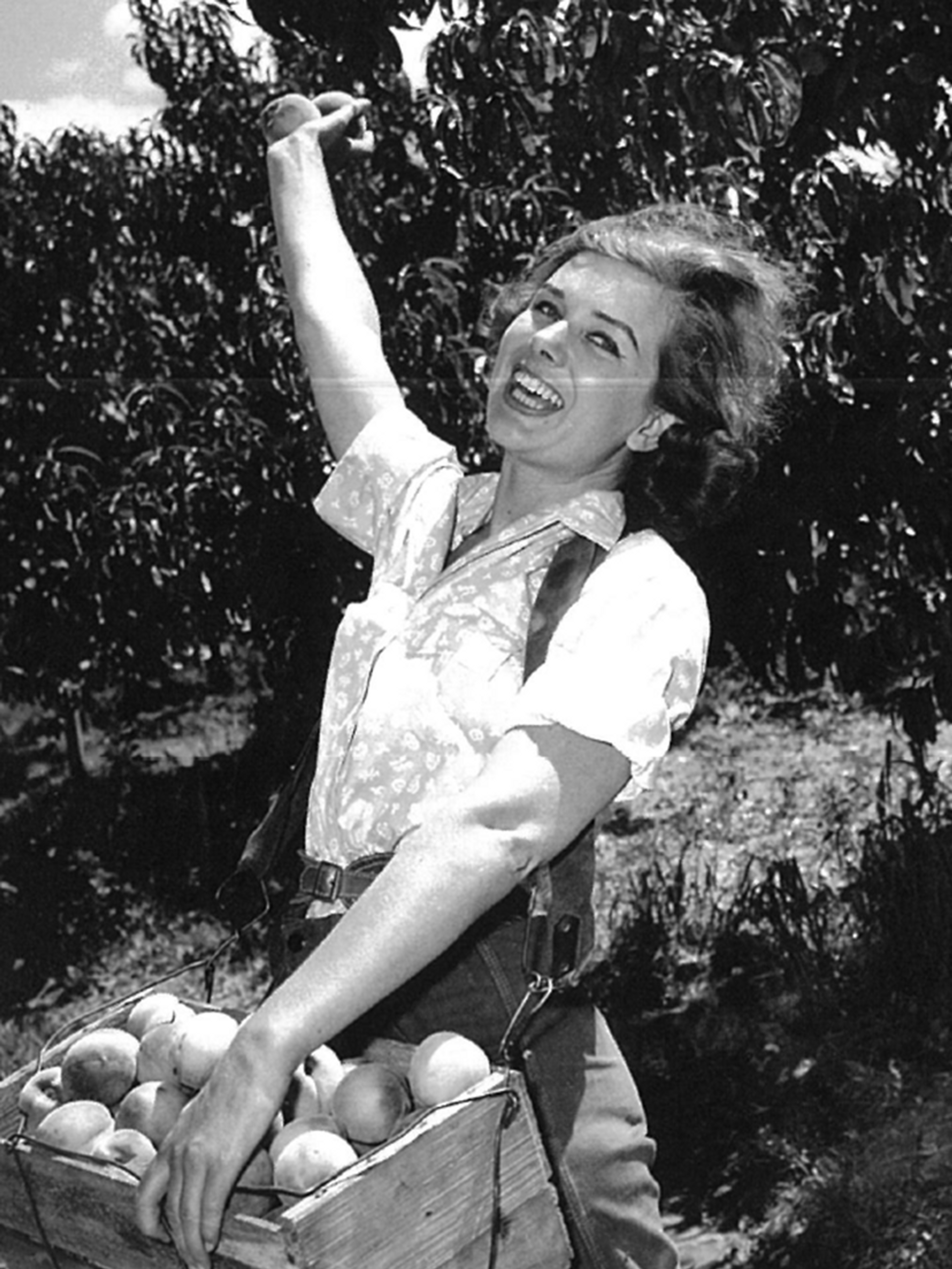
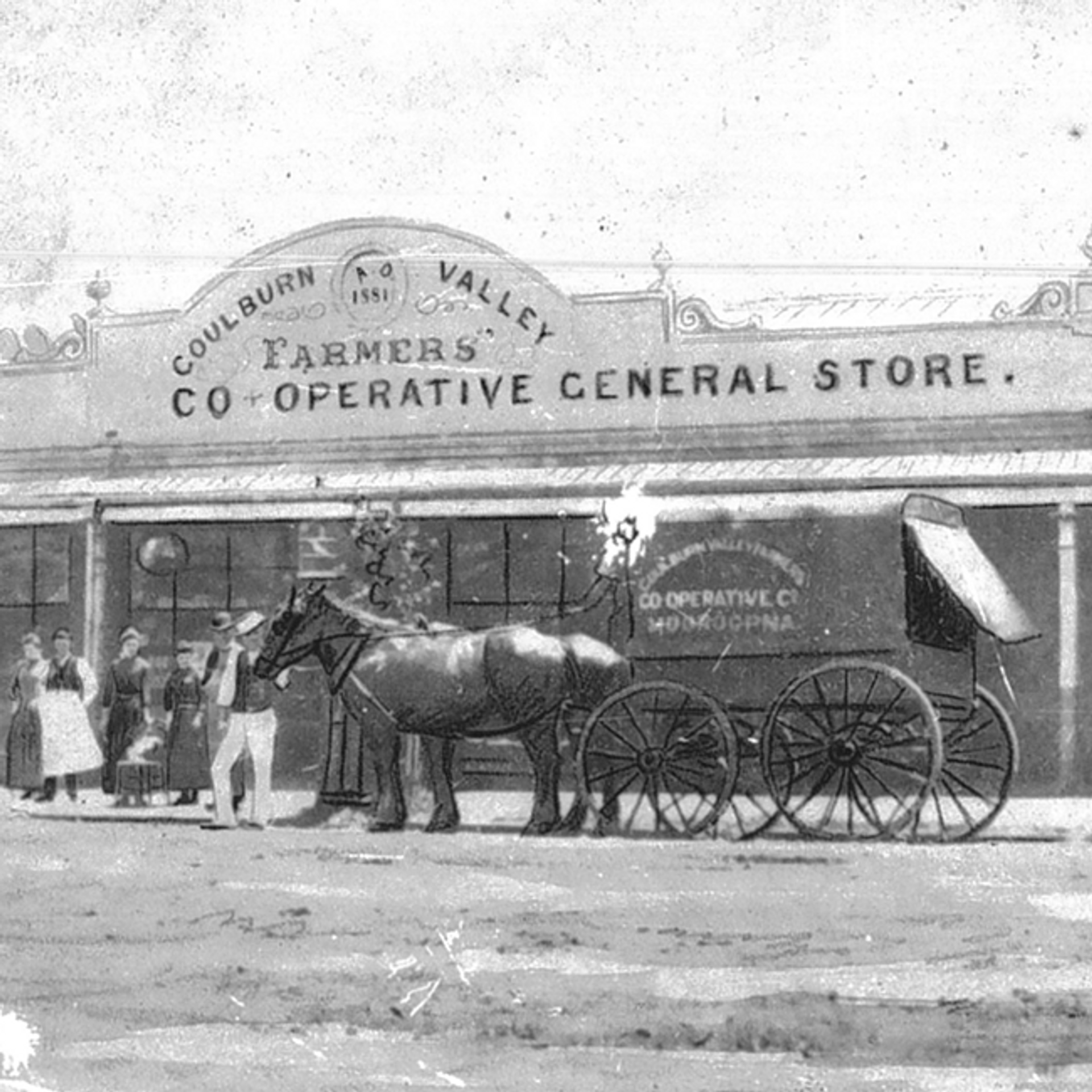
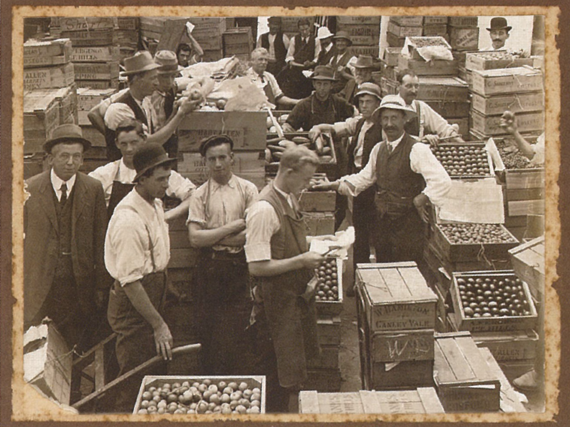
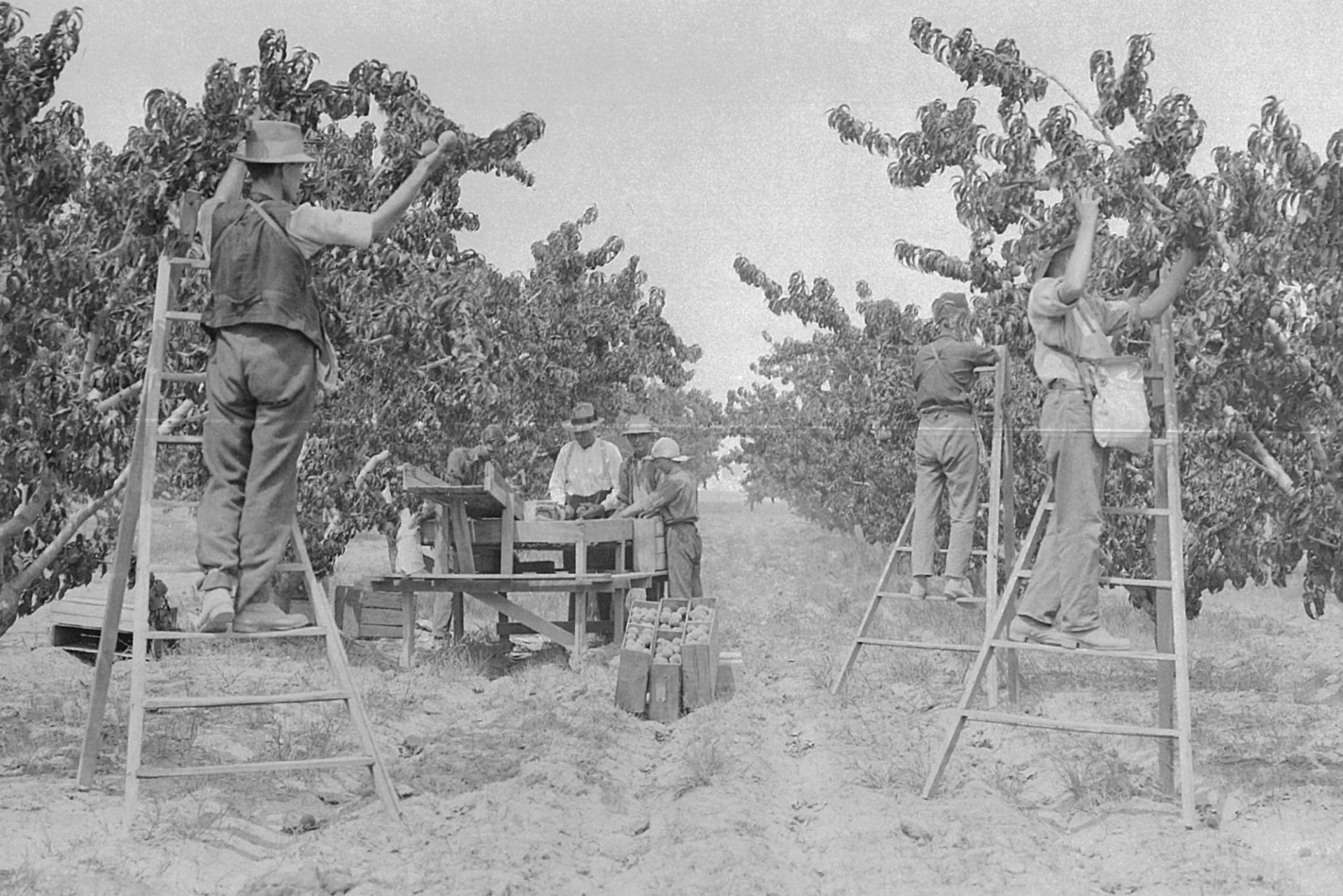
Goulburn Valley is a heritage fruit brand beloved for generations, capturing the essence of a region brimming with natural bounty. Here, the sun-kissed soil, the crisp air, and the warm sun combine to create the perfect growing conditions for fruit that simply tastes better. With new owners guiding the brand, we looked to reignite the nation's passion for the fruit of Goulburn Valley and restore this icon to its rightful place as the premium choice in preserved fruit.
The Challenge
With new ownership, daring aspirations and expansion plans emerged for the brand. Our task was to craft a revitalized identity that positioned Goulburn Valley as a top-shelf fruit brand, standing out from the competition and forging a unique path for growth into uncharted categories. We envisioned a fresh perspective on preserved fruit, and sought to unleash our vivid imagination and offer new, imaginative ways to savour its flavour.
The Solution
Collaborating with the Goulburn Valley team, we developed a new brand strategy that elevated them to the premium and innovative leader in the preserved fruit aisle. Harmonising research and insights, we crafted a blueprint for the brand - a vivid declaration of its purpose, a unique and compelling concept at its core, and a set of unwavering beliefs that set Goulburn Valley apart. Our brand essence "Fruit Re-Imagined" served as the foundation for a bold and creative approach. This strategy laid the groundwork for future growth into additional categories, aligning with their broader business goals.
As the leading name in preserved fruits, the Goulburn Valley marque embodies the brand's prestige and excellence.
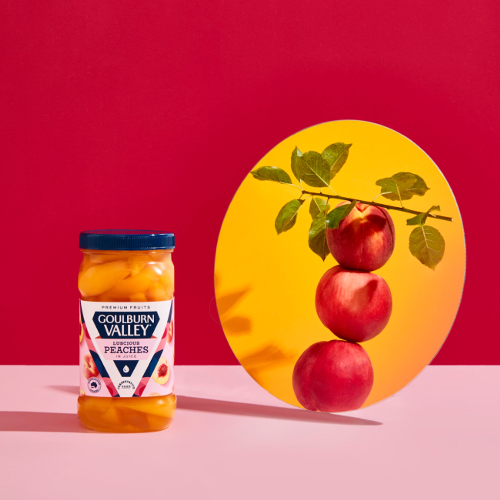
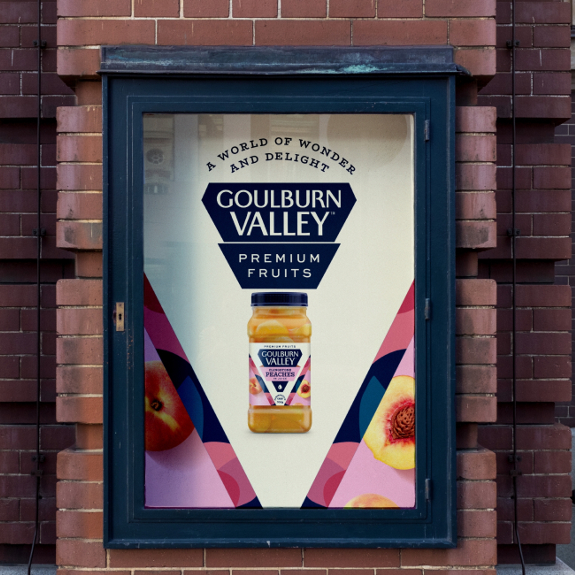
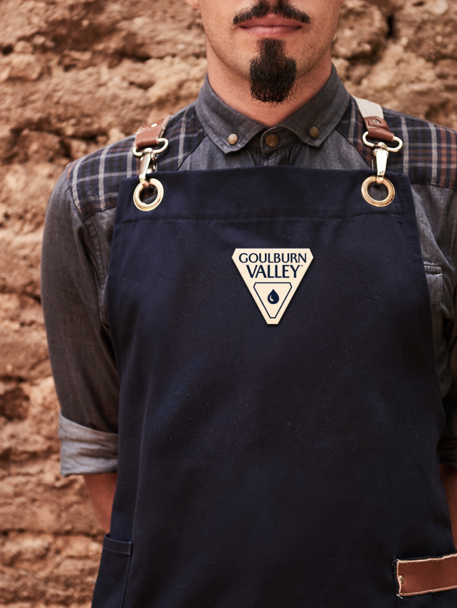
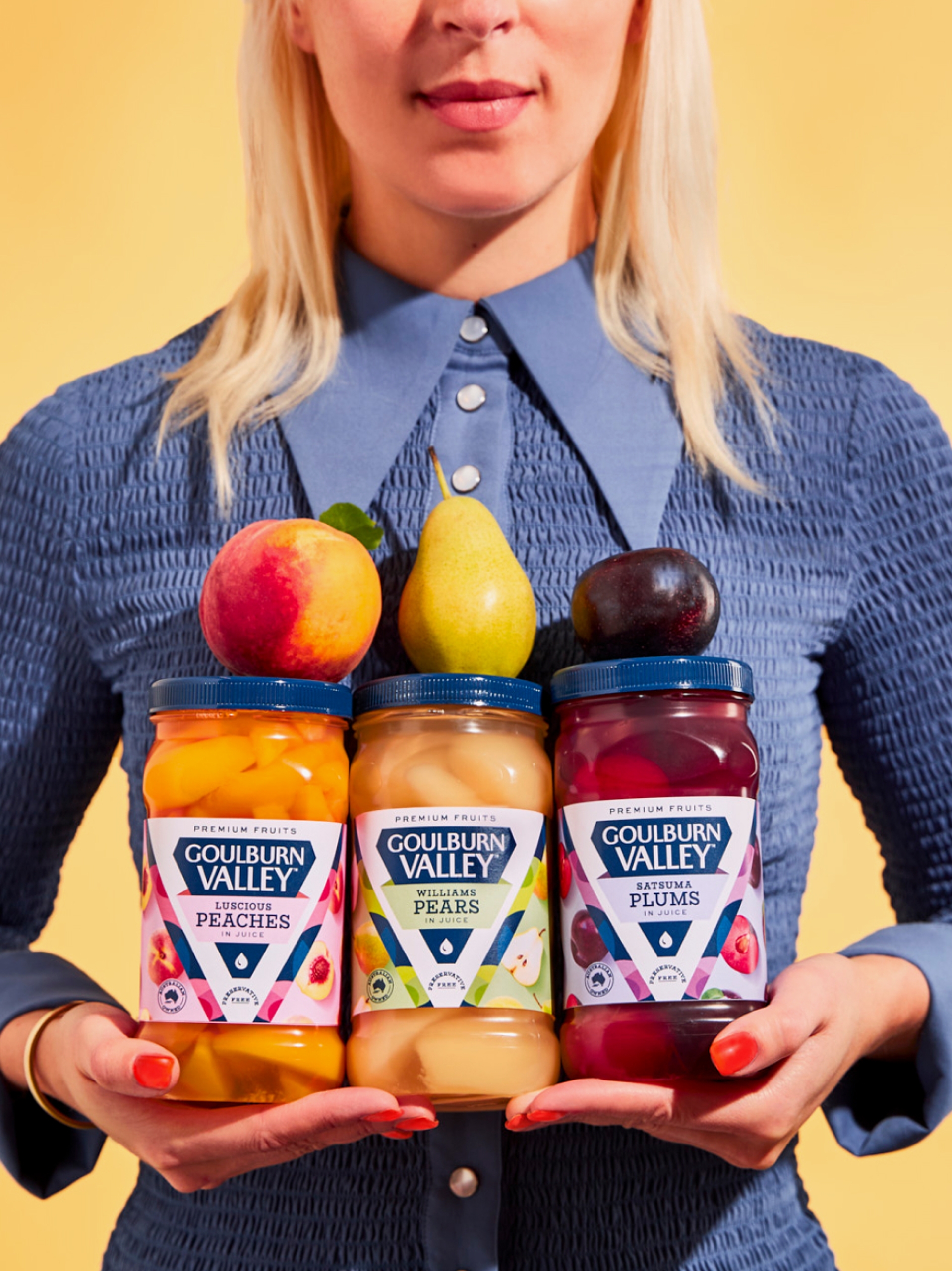
The Goulburn Valley brand marque underwent a complete transformation, birthing a bold and recognizable 'V' shaped logo. The shape pays homage to the valley's name, echoing the 'V' in Valley and showcasing its rich heritage. This iconic design also resembles a cut diamond, alluding to the brand's unwavering commitment to premium quality. A juice droplet locked within the design symbolizes the finest selection of fruit and its placement, cascading down the diamond, is a testament to the superiority of Goulburn Valley produce.
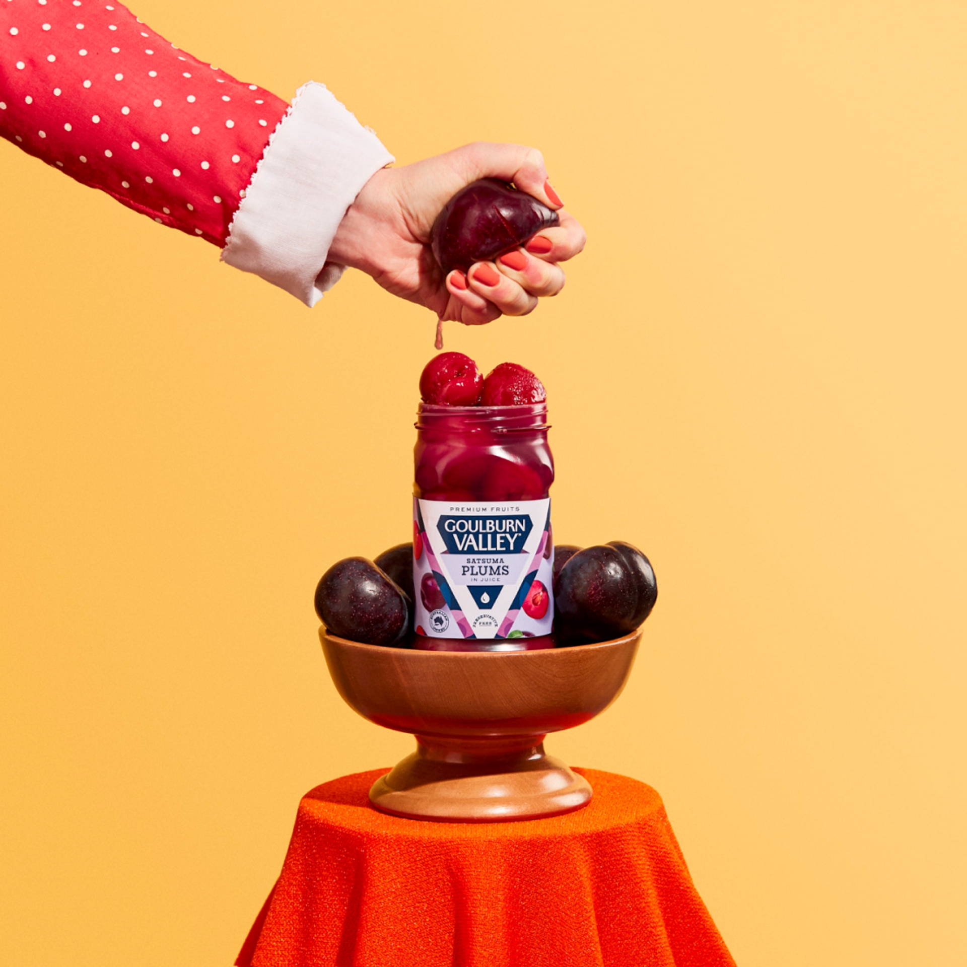
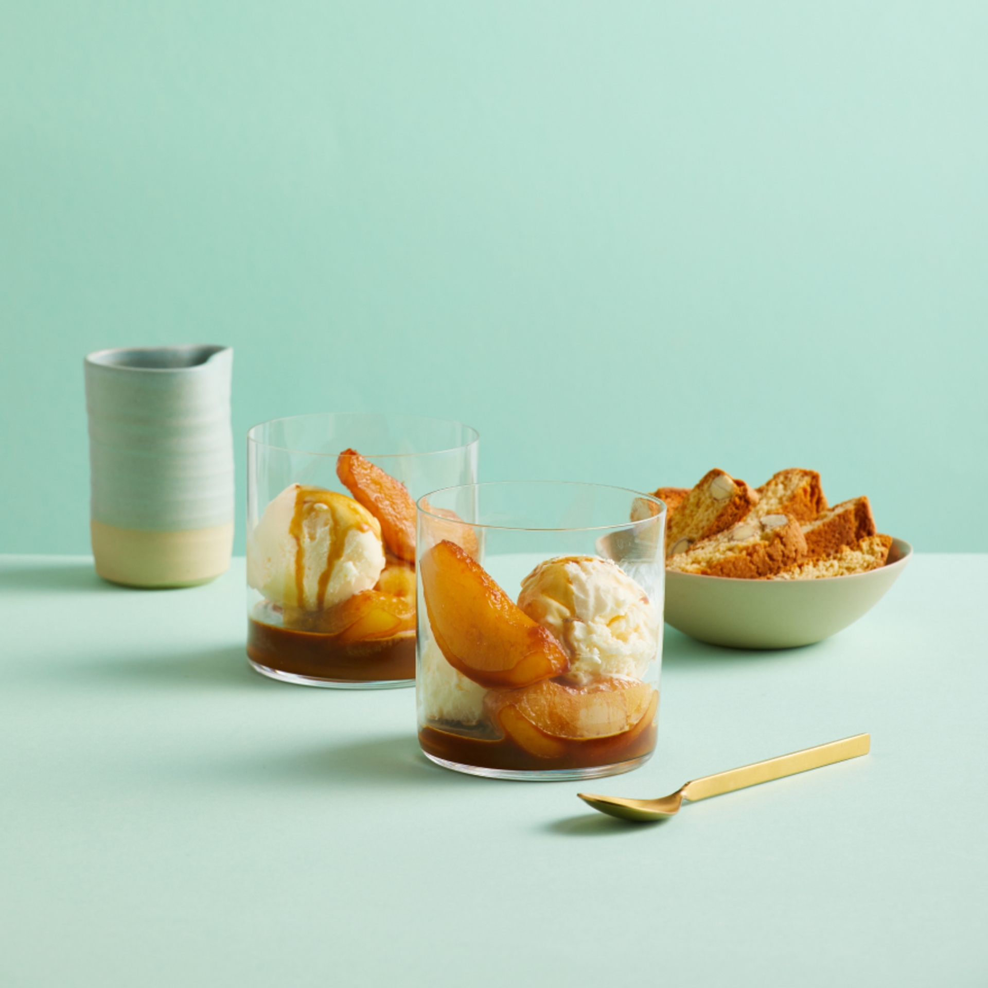
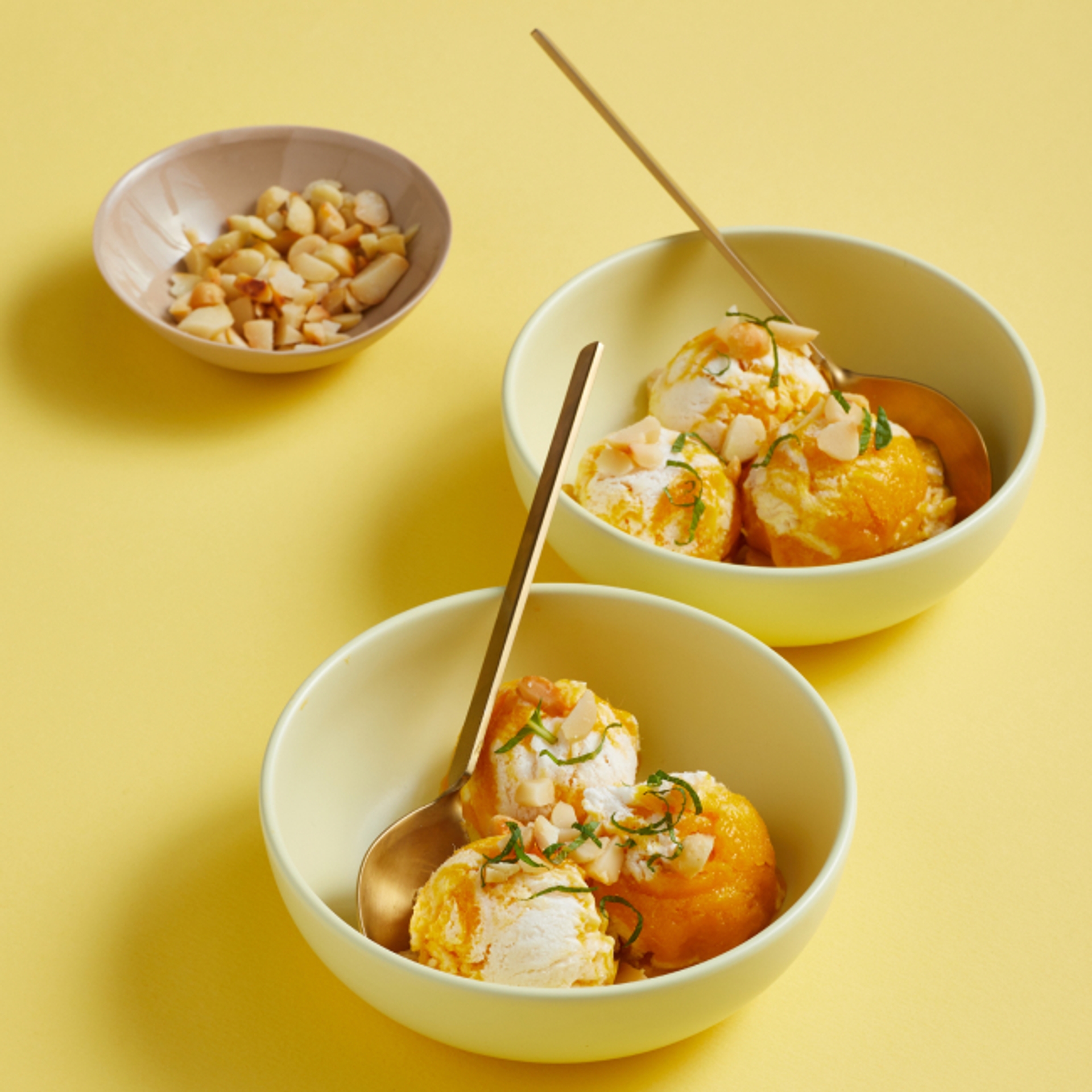
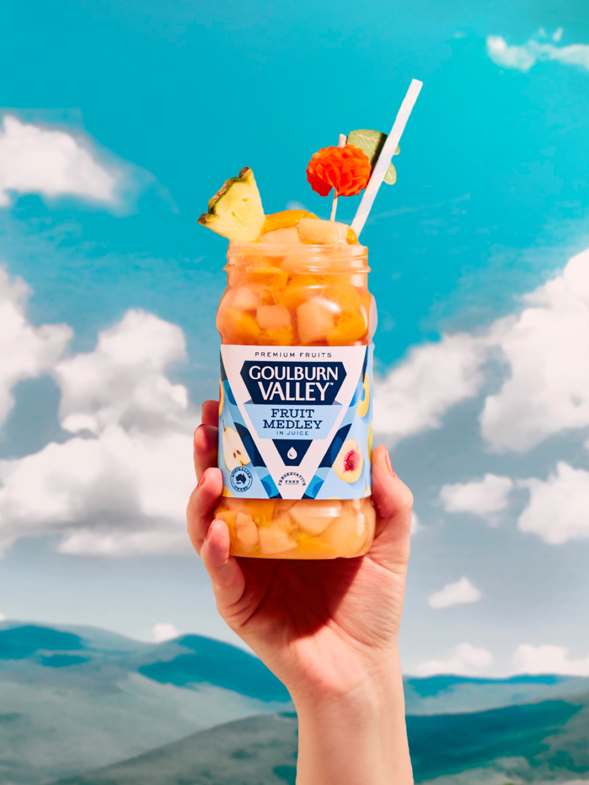
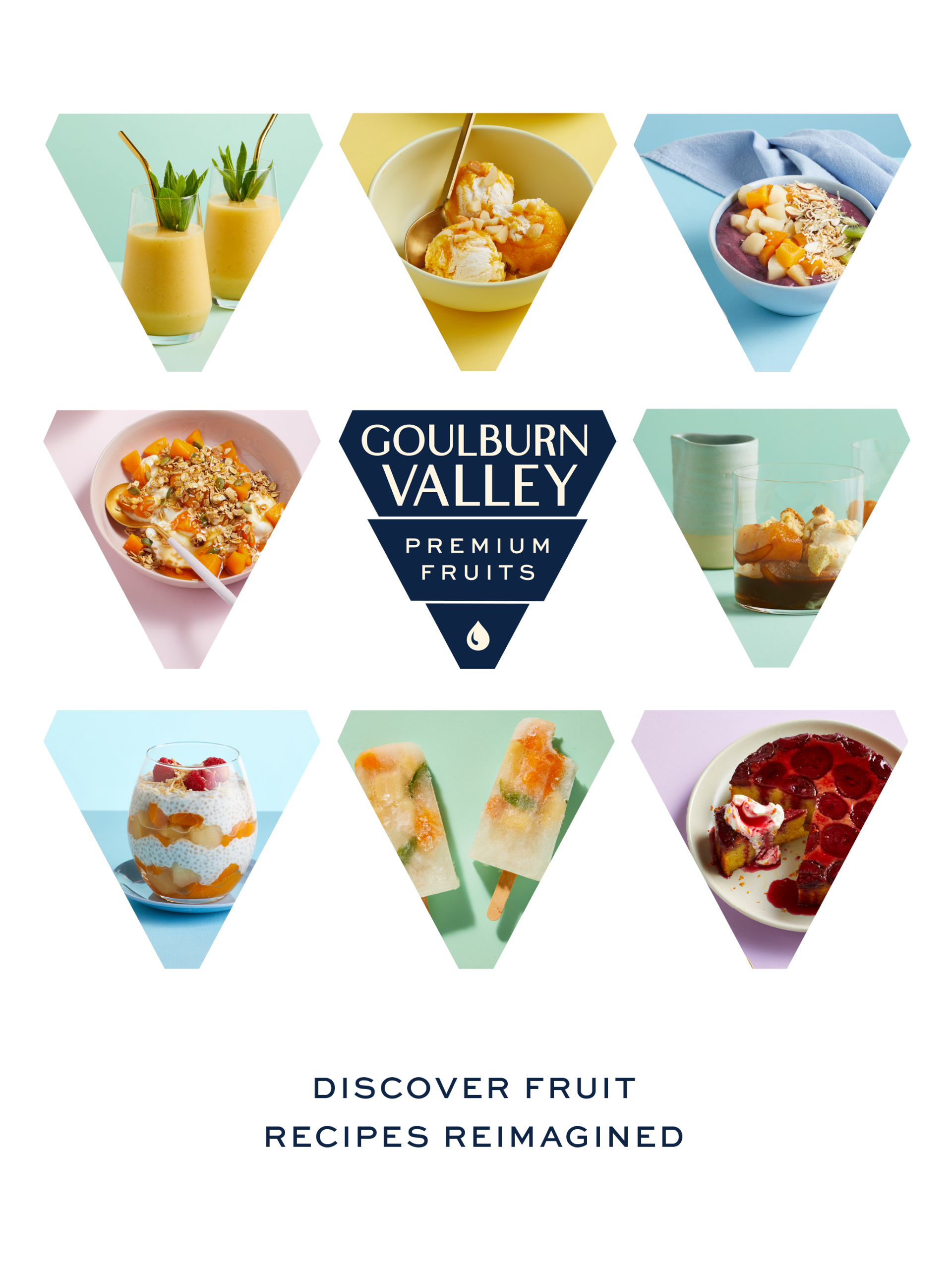
'Fruit-Reimagined' embodies the art of reinvention, pushing the boundaries of conventional fruit. From bold flavour pairings to inspired presentation styles, our goal was to elevate Goulburn Valley fruit to new heights.
Re-imaginingAn Iconic FruitGiant
The Packaging
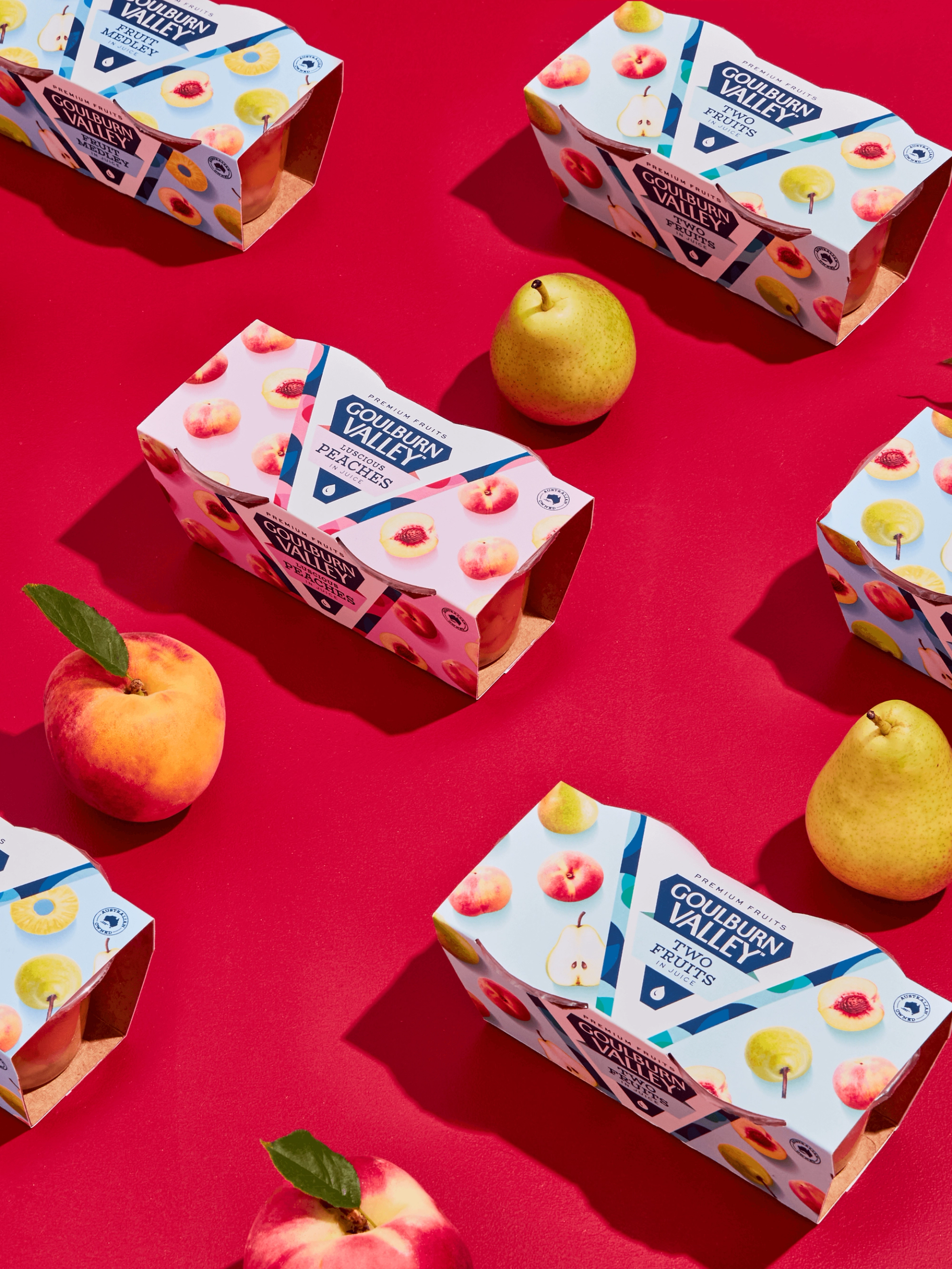
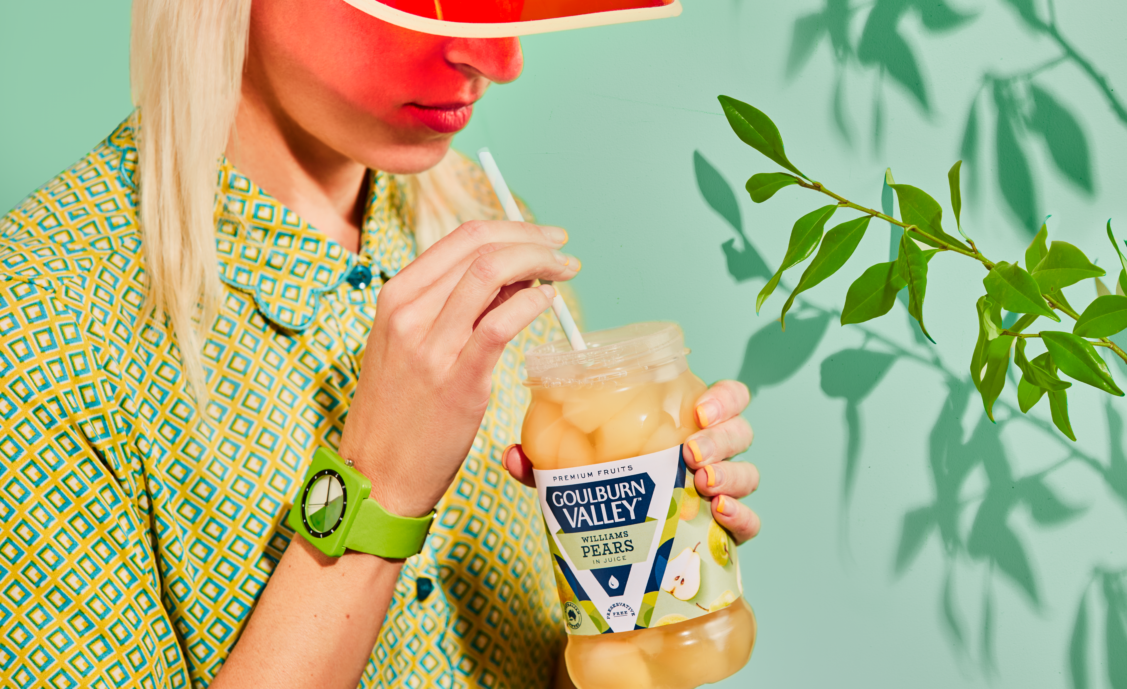
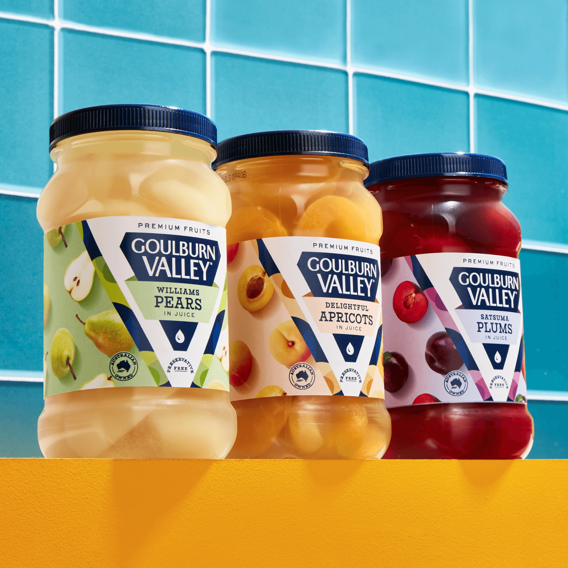
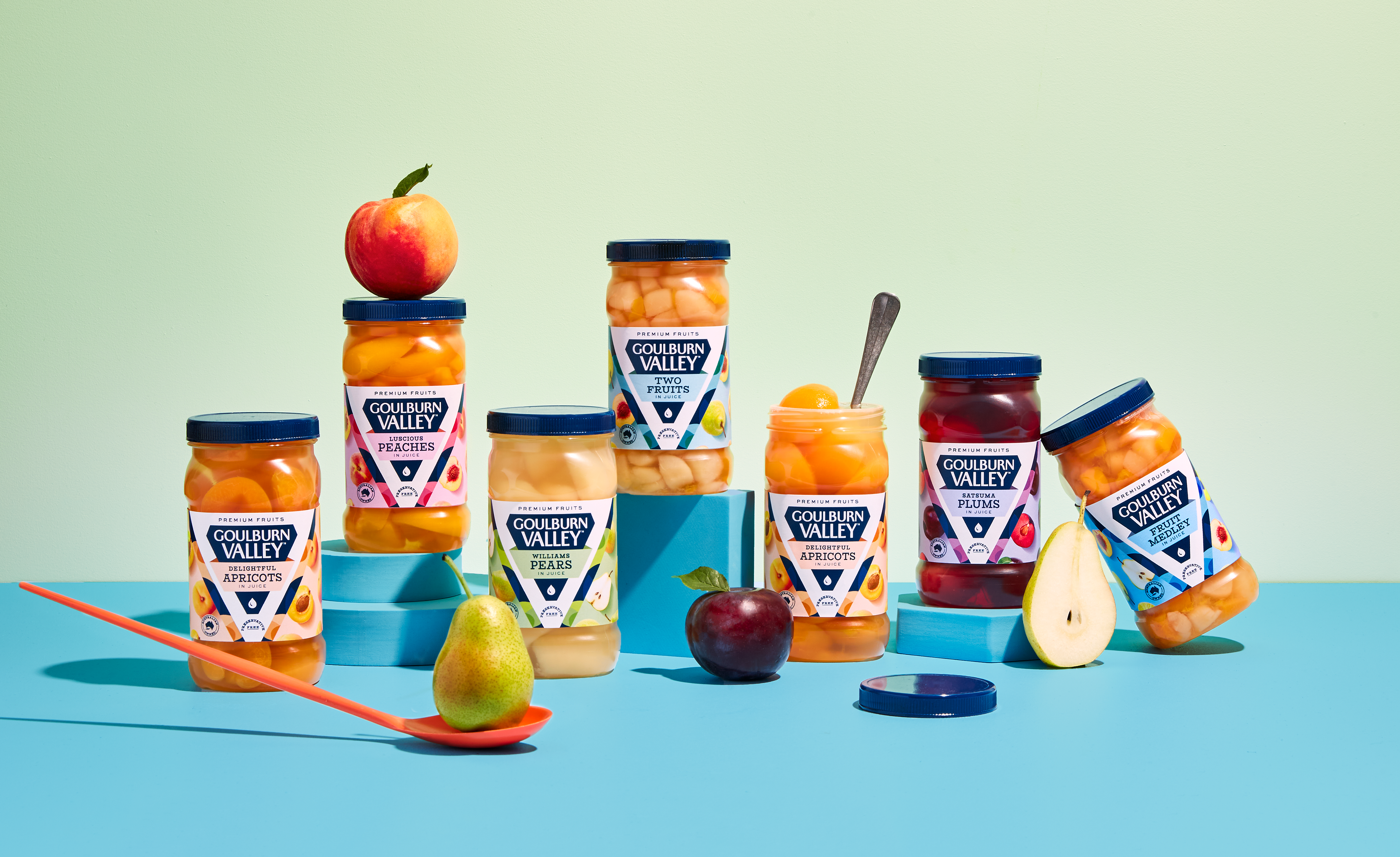
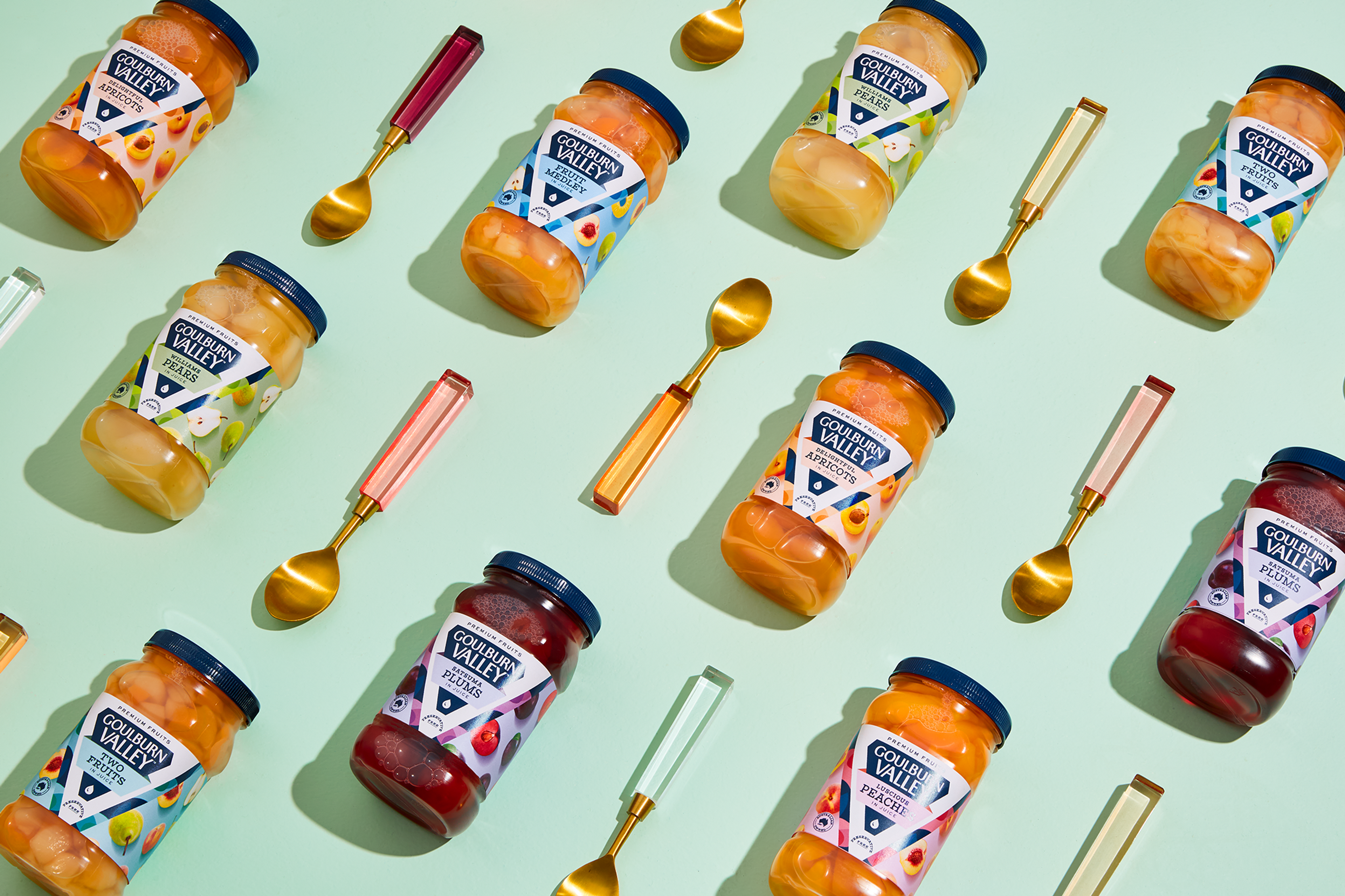
The new brand marque takes centre stage on the packaging, its grand design serving as the defining feature and encircling the variant name. Breathing life into the otherwise monotonous variant names, the logo embraces imaginative titles such as ‘Clingstone Peaches In Juice’, elevating the brand above its competitors and imbuing each jar with a greater sense of value and superiority. The brilliance of the fruit is captured through each jar, inspiring us to craft a visually stunning pattern on the label, with delicate pastel hues serving as the backdrop, guiding consumers and intensifying the flavours. An artistic abstract pattern echoes the shape of the diamond logo, further fortifying the brand's iconic mark. The packaging design exudes confidence, radiating the brand's unique spirit and offering versatility across different formats, with the emblematic brand marque residing steadfast at the core of each pack.
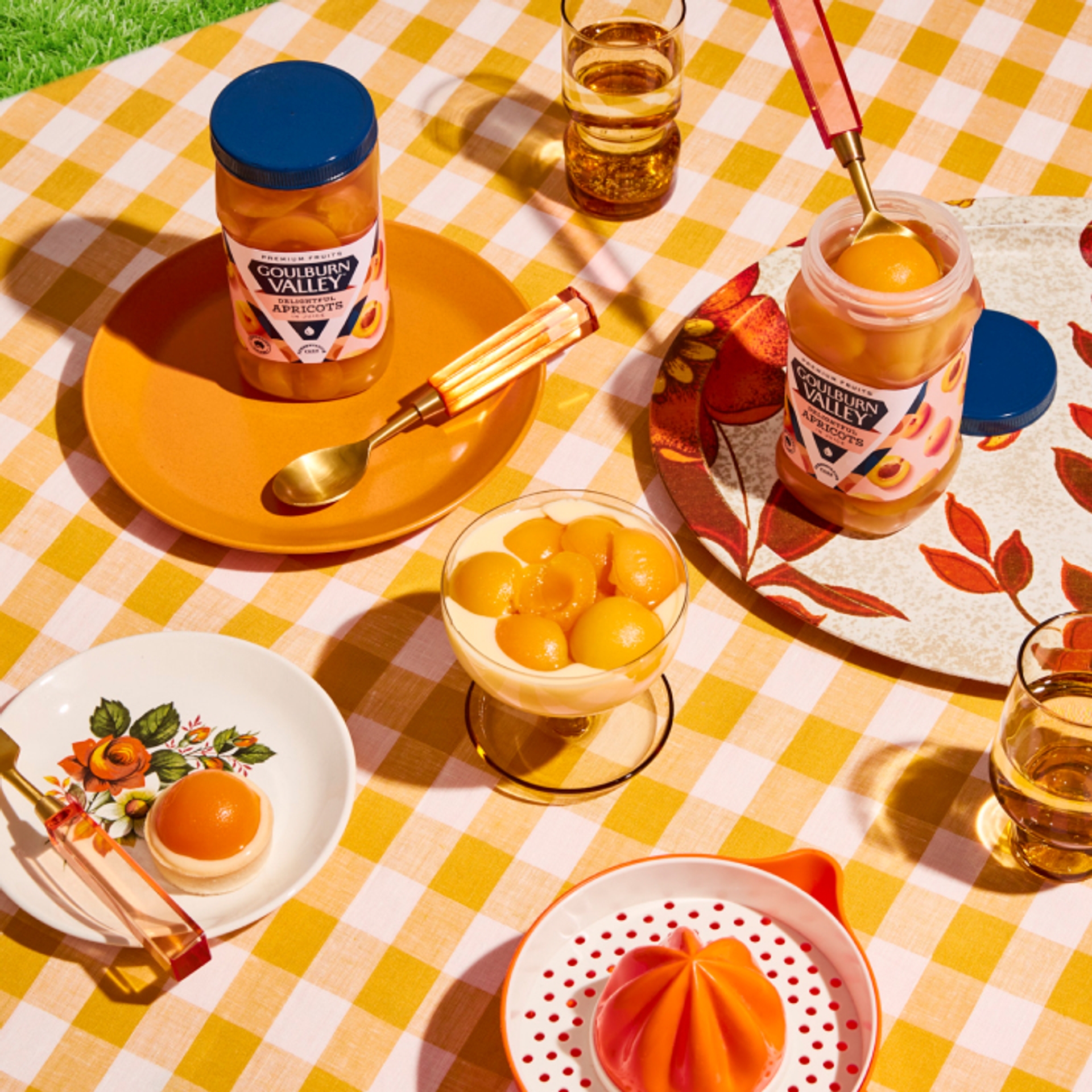
This is a celebration of the endless possibilities that fruit offers, inviting you on a journey to discover the freshest, most exciting and captivating fruit experiences.
Contact us
Let's chat about your brand...

Liberty Coast
Crafting a seltzer brand that embodies the essence of an Australian lifestyle with an invitation to indulge in a healthier choice.

Primo
Rebrand the nation's leading smallgoods meat brand to uphold its title and elevate it to the next level as a meaningful food brand.

Liberty Coast
Crafting a seltzer brand that embodies the essence of an Australian lifestyle with an invitation to indulge in a healthier choice.
