



Hans
Combining European culinary tradition with the charm of a charismatic founder for an accessible-craft meats brand.
Hans
- Brand Strategy
- Brand Identity
- Packaging Design
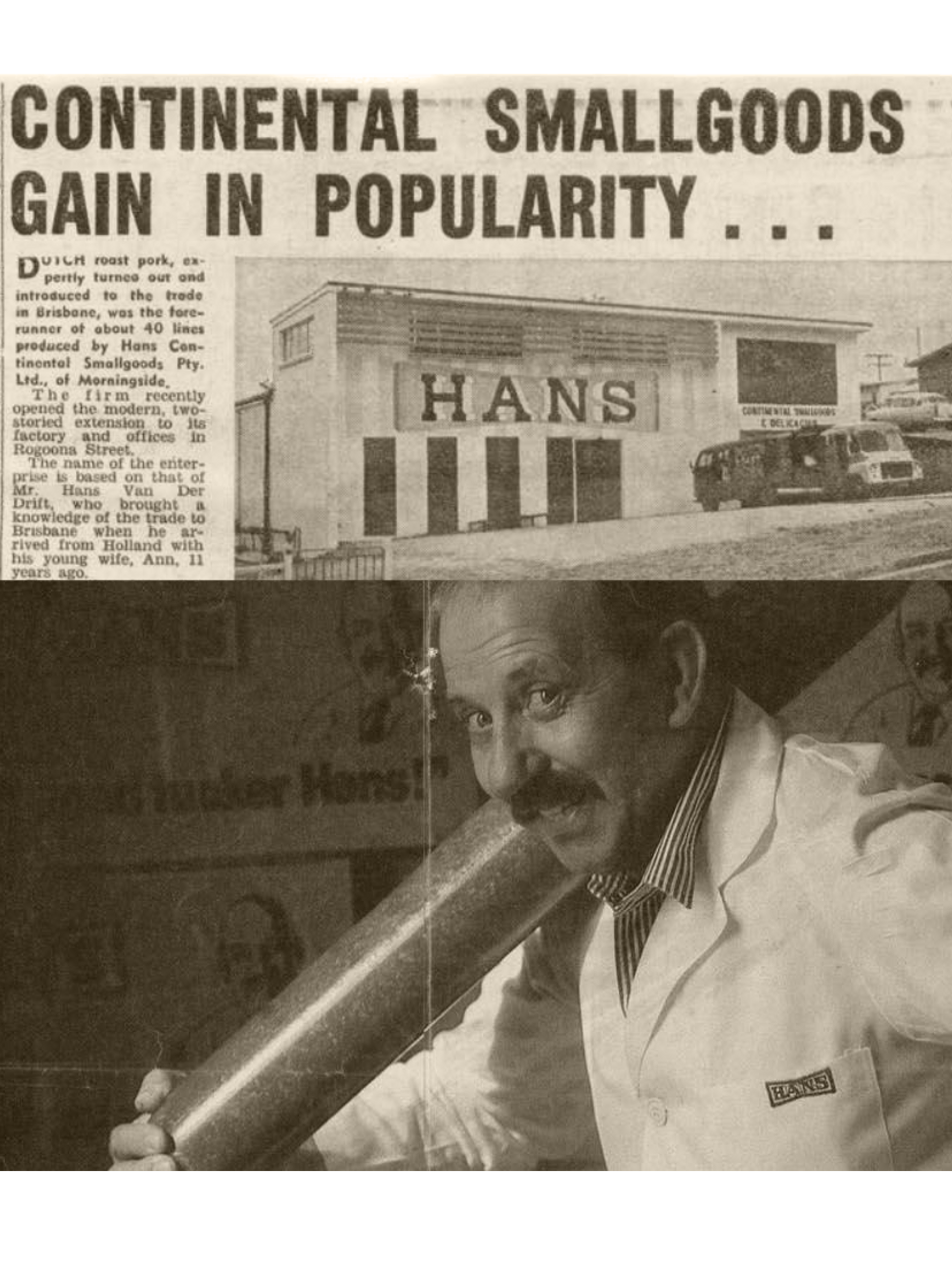
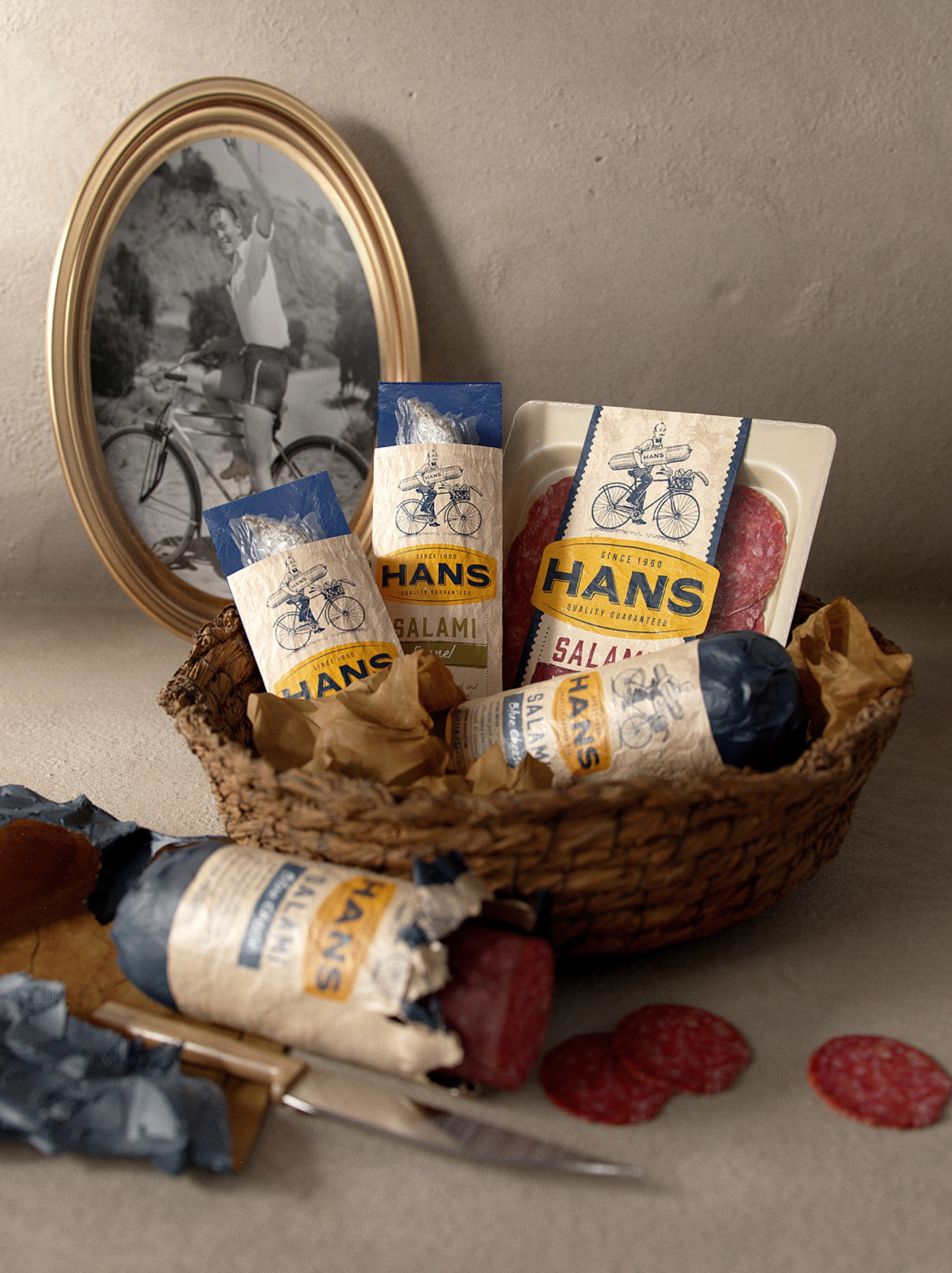
The Hans brand was born in 1960 from humble beginnings in Queensland, Australia. With a strong commitment to European culinary traditions, the brand has honed its craft in creating authentic smallgoods over the last 60 years. This dedication has resulted in the brand becoming a successful national smallgoods brand, sold in supermarkets throughout Australia. Despite this success, the time has come for the brand to re-establish its place and position in the market in order to fulfill its ambitions for further growth.
The Challenge
Tasked with creating a new brand strategy that positioned Hans as the continental meat specialist, we defined the brand's purpose to share the enjoyment of food in the warmth of good company. A refreshed brand identity was needed, along with a packaging design suite for their expanding portfolio. The challenge was to incorporate the rich history and legacy of the brand laid by the founder Hans himself, and to ensure a comprehensive portfolio architecture was in place. This was necessary to be able to accommodate the large range of products offered, as well as new product developments in the future.
The Solution
We led collaborative workshops with the Hans Marketing Team to define a new strategic brand idea. We uncovered a new positioning for the brand, along with a brand personality, narrative and attributes that provided a clear path for brand behaviour and growth.
Bringing the 'Accessible Craft' of Hans to the everyday required a story of authenticity and charm that had broad appeal.
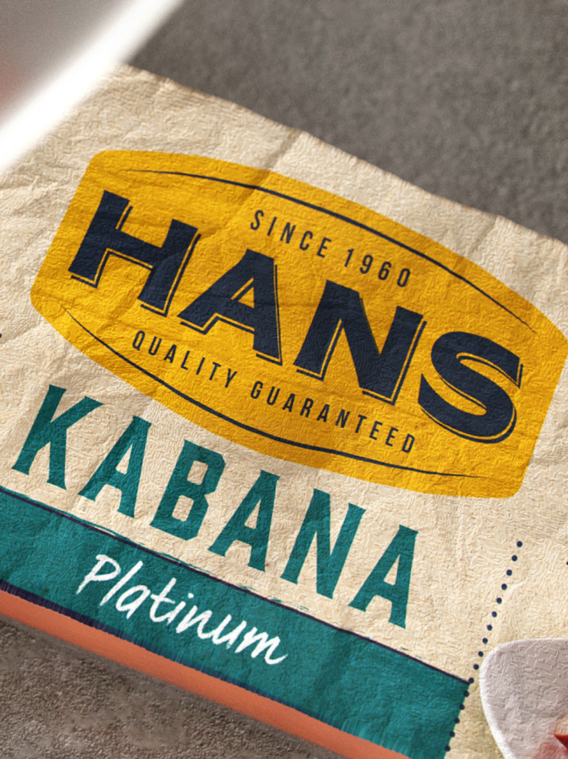
When embarking on the rebrand and packaging design, the intention was to express the brand's unique offering of "Accessible Craft". This meant that while the brand employed time-honoured European methods and skills in the creation of their meats, it wasn't so exclusive or expensive that consumers found it unapproachable. One of the key challenges was to create a design that would effectively communicate the brand's dedication to quality, while also striking the right balance between tradition and modern relevance.
It was time to bring the charm of the founder, Hans to the forefront of the brand.
Introducing, Hans
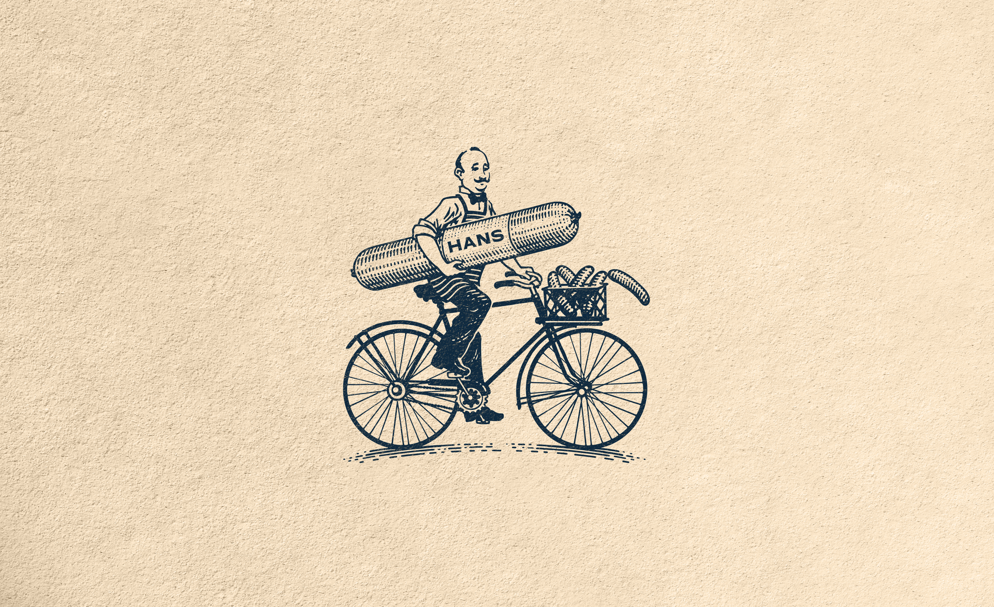
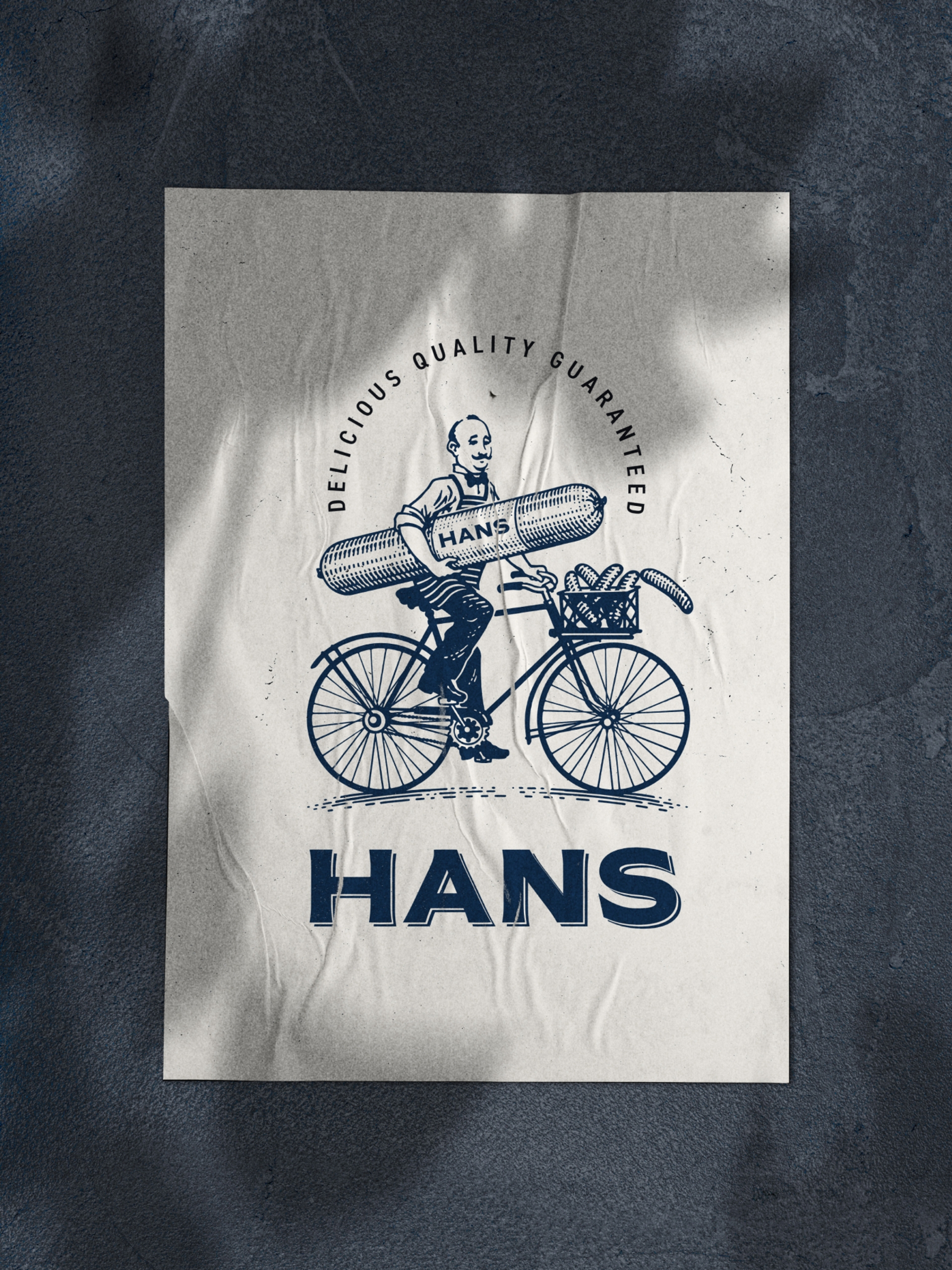
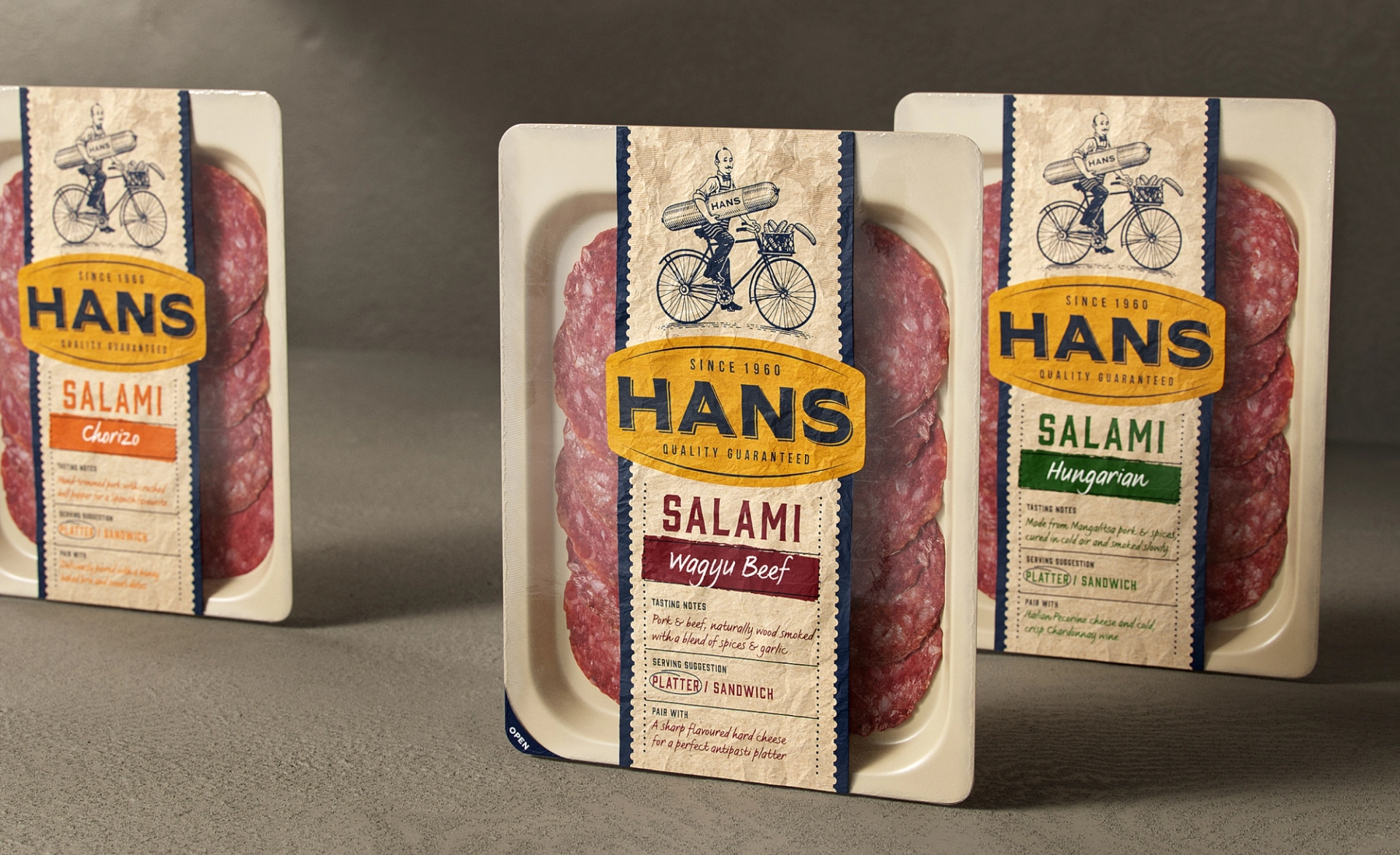
When Hans first began making his smallgoods he would ride his bicycle to hand deliver his products to his customers. We integrated this care and effort, along with his well-loved personality into a unique signature brand asset. This original illustration is the main feature across the packaging design, as well as utilised in branded communications. (Illustration By Blair Sayer)
Packaging Design
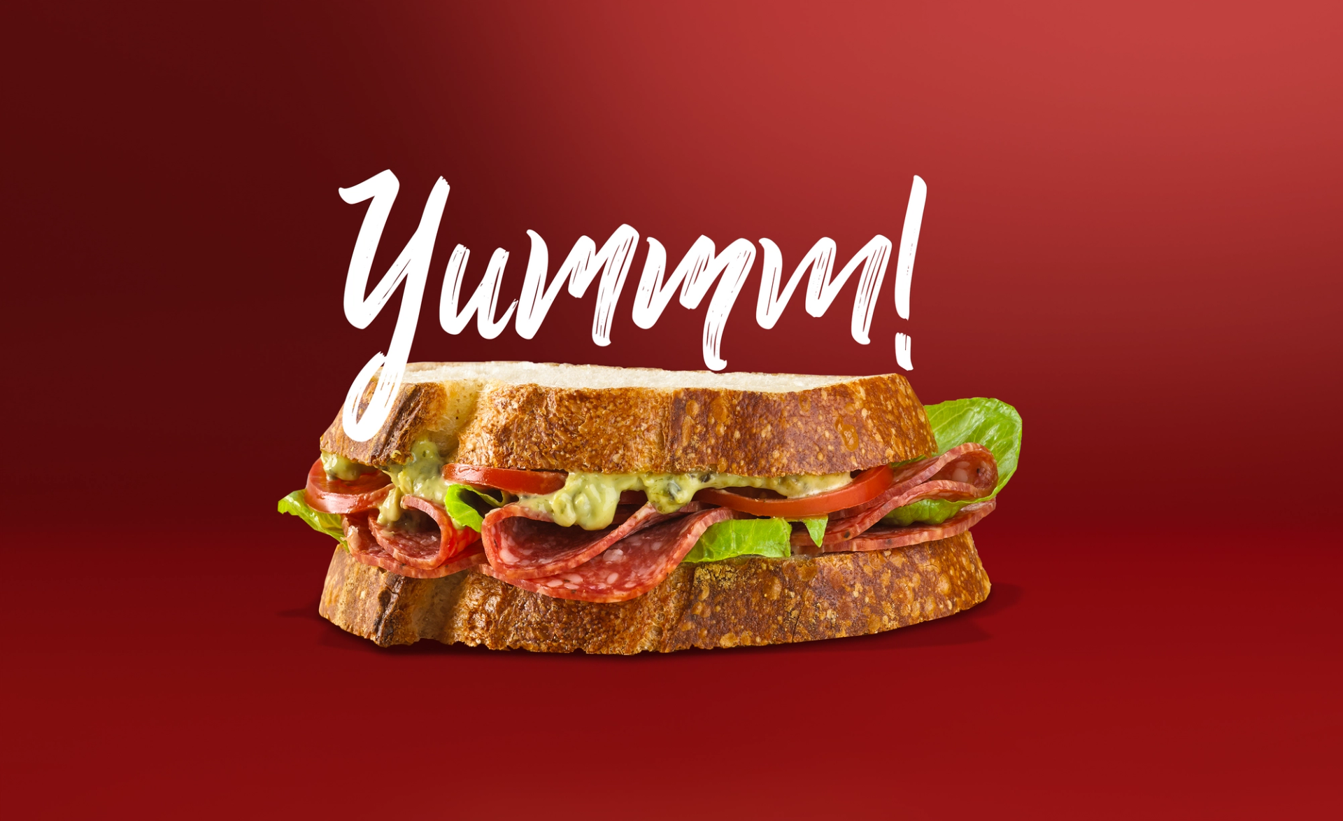
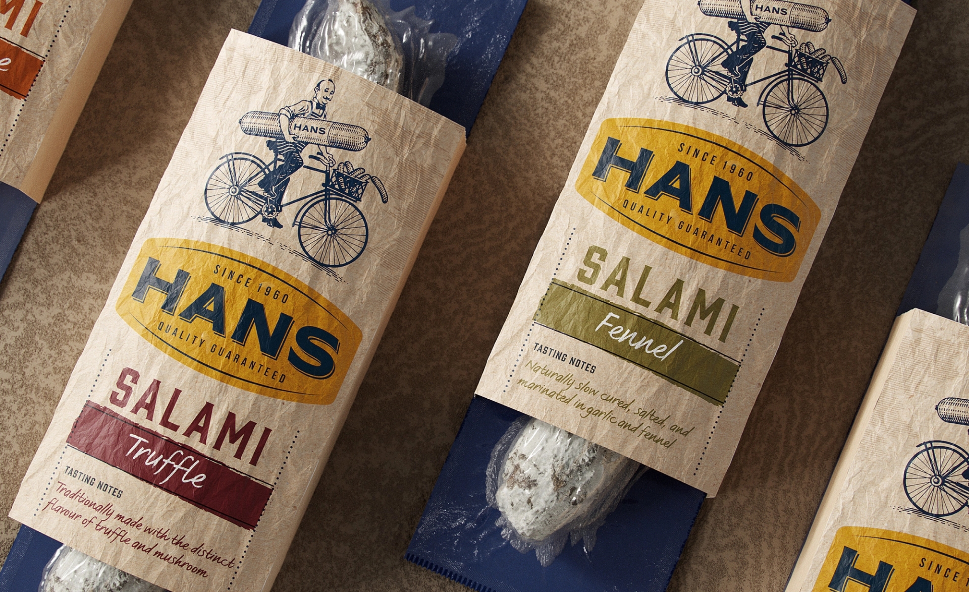
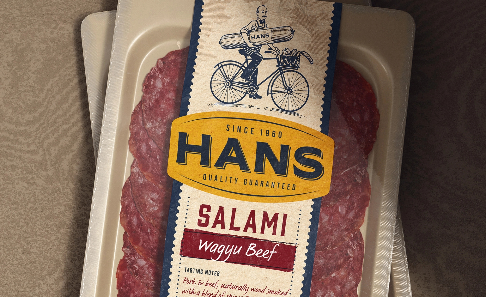
The packaging design was reinvented to showcase the meat in an appetising large display, while also capturing the natural and authentic cues of delicatessen packaging. To achieve this, we used a tactile paper substrate that creates a sensory texture, highlighting the natural quality of the meat, standing out in contrast to the plastic packaging used by competitors. The design layout was made to be flexible to adapt to different shapes and sizes of packaging. To further enhance the appetite appeal, we incorporated tasting notes that highlight key ingredients.
Contact Us
Let's chat about your brand...

Noble Fellows
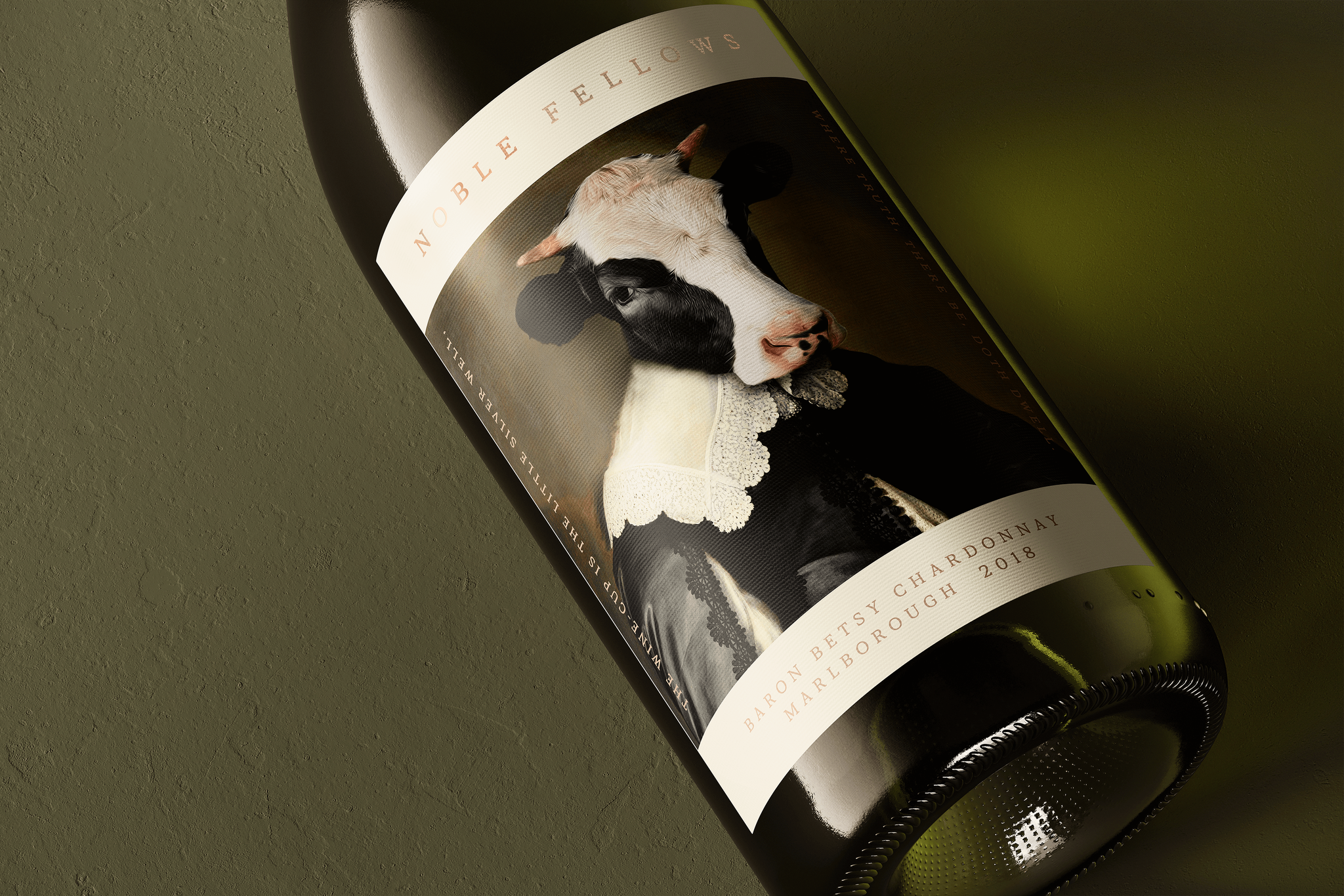
A tale of humour and history entwined to reveal a captivating New Zealand wine brand to disrupt a saturated market.

Tequila 125
Creating an homage to the agave tequila heritage and those who are dedicated to producing one of the worlds most unique spirits.

Noble Fellows
A tale of humour and history entwined to reveal a captivating New Zealand wine brand to disrupt a saturated market.